
This template creates a set of images that is useful for linking to wiki pages.
Importing the template[Bearbeiten | Quelltext bearbeiten]
Die benötigte Import-Datei befindet sich im Archiv HW-Bildkarten.zip. Sie enthält die Datei HW-Bildkarten.xml.
Führen Sie auf der Seite Spezial:Import in Ihrem Wiki folgende Schritte durch:
- Entpacken Sie die zip-Datei.
- Klicken Sie Browse... und wählen Sie die Datei HW-Bildkarten.xml.
- Geben Sie ein Interwiki-Präfix an. Da dieses Feld erforderlich ist, geben Sie hier einfach hw (für hallowelt) ein.
- Belassen Sie die Vorauswahl Zu den Standard-Speicherorten importieren.
- Klicken Sie Datei hochladen... .
Die Vorlage ist nun in Ihrem Wiki verfügbar .
Enthaltene Importdateien[Bearbeiten | Quelltext bearbeiten]
The xml import erstellt folgende Seiten:
- Template:Image_cards
- Template:Image_cards/start
- Template:Image_cards/end
- Template:Image_cards/styles.css
Adding image cards to a page[Bearbeiten | Quelltext bearbeiten]
General considerations[Bearbeiten | Quelltext bearbeiten]
- Start and end templates: Each card set needs the start template (Image cards/start) and the end template (Image cards/emd). Make sure to add the end template right after the last image card without a line-break. If you have a line break, you will see some unnecessary space after the last card.
- Card sizes: You can choose between medium (standard), small and large image cards. By default, standard cards are shown.
- Images or icons: You can choose to create image cards or icon cards. Icon cards are only available in the sizes small and medium. If you want to uses images, you need to upload them to your wiki first.
See below for a complete list of available settings (template parameters).
Image cards[Bearbeiten | Quelltext bearbeiten]
The easiest way to add card is to choose a starting layout from the examples provided on this page. Simply copy and paste the example code in source-editing mode into your page.
Standard-sized image cards[Bearbeiten | Quelltext bearbeiten]
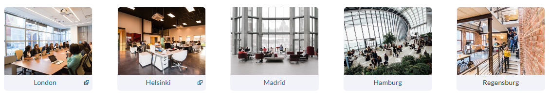
Code to copy:
{{Image cards/start|cardsize=}}
{{Image cards|imgname=yourimage1.jpg|label=London|imglink=https://google.de|alt=office in London headquarters}}
{{Image cards|imgname=yourimage2.jpg|label=Helsinki|imglink=http://google.de|alt=}}
{{Image cards|imgname=yourimage3.jpg|label=Madrid|imglink=Main Page|alt=}}
{{Image cards|imgname=yourimage4.jpg|label=Hamburg|imglink=Main Page|alt=}}
{{Image cards|imgname=yourimage5.jpg|label=Regensburg|imglink=|alt=}}{{Image cards/end}}
Large image cards[Bearbeiten | Quelltext bearbeiten]
Code to copy:
{{Image cards/start|cardsize=large|flexwrap=wrap}}
{{Image cards|imgname=yourimage1.jpg|label=Sales & Marketing|imglink=Main Page}}
{{Image cards|imgname=yourimage2.jpg|label=IT Admin|imglink=Main Page}}
{{Image cards|imgname=yourimage3.jpg|label=Development|imglink=Main Page}}
{{Image cards|imgname=yourimage4.jpg|label=Tech Support|imglink=Main Page}}
{{Image cards|imgname=yourimage5.jpg|label=Accounting|imglink=Main Page}}
{{Image cards|imgname=yourimage6.jpg|label=Management|imglink=Main Page}}{{Image cards/end}}
Icon cards[Bearbeiten | Quelltext bearbeiten]
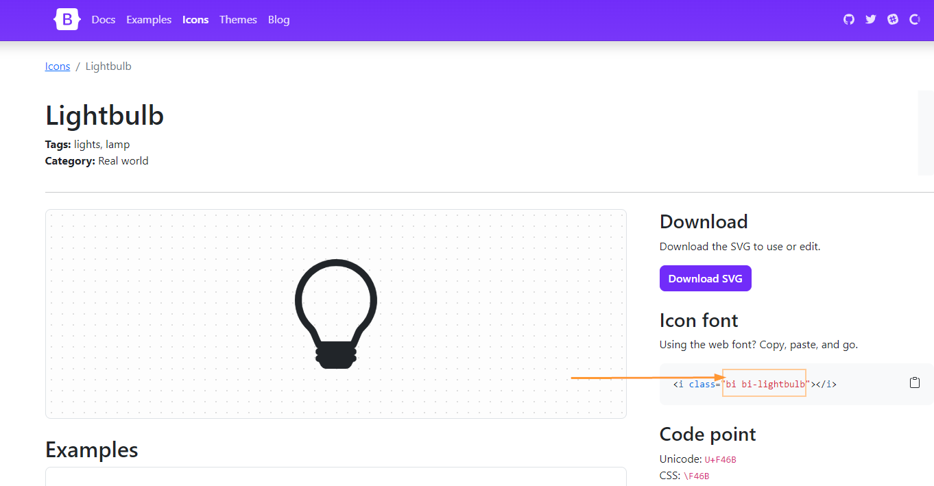
For icon cards, you can use most current bootstrap icons. (BlueSpice includes Bootstrap icons v.)
On the bootstrap icons website, select an icon by clicking on it. Copy the name of the icon font into your template.
- Icon cards support card sizes medium (standard) and small, but not large.
Code to copy:
{{Image cards/start|cardsize=}}
{{Image cards|iconname=bi bi-gear|iconcolor=Tomato|label=Processes|imglink=Main Page|alt=}}
{{Image cards|iconname=bi bi-lightbulb|label=How-to's|imglink=Main Page|alt=}}
{{Image cards|iconname=bi bi-eyeglasses|label=Knowledge base|imglink=https://google.de|alt=}}
{{Image cards|iconname=bi bi-signpost|label=Directories|imglink=Main Page|alt=}}
{{Image cards|iconname=bi bi-geo-alt|label=Locations|imglink=|alt=}}{{Image cards/end}}
Available settings[Bearbeiten | Quelltext bearbeiten]
Template:Image_cards/start[Bearbeiten | Quelltext bearbeiten]
| Parameter | Value | Description |
|---|---|---|
| cardsize |
|
Sets the size of the individual cards |
| justifycontent |
|
Spreads the cards out evenly in the available space |
|
If there is a wrap to another line, the cards are left-aligned | |
| flexwrap |
|
Cards get smaller if many images are added to avoid wrapping |
| flexwrap |
|
Cards keep their original size. Images that don't fit on the first row will move to the next row.
This setting should be used with cardsize=large. |
Template:Image_cards[Bearbeiten | Quelltext bearbeiten]
| Parameter | Value | Description |
|---|---|---|
| imgname | e.g.:
myimage.jpg, myimage.png |
Name of the image without a namespace prefix.
It needs to be blank or not present if icons are used instead of images. |
| label | e.g.:
London |
Label that is shown under the image/icon. |
| imglink | e.g.:
Main_Page Help:Main_Page https://google.com |
Link to a wiki page or a website.
The link is optional. |
| alt | e.g.:
office in London headquarters |
Provided for assistive technologies of users who cannot see the image.
This is not necessary when using icons, since icons are loaded as background images only. |
| iconname | e.g.:
bi bi-lightbulb |
Used instead of imgname if icons are used as a visual. |
| iconcolor | e.g.:
Tomato, #607d8b |
HTML-color value. This includes color names or generally HEX-values. |
Diskussionen